The thumbnail and background of a YouTube video is hands down the most important thing you create. It's what grabs a viewer's attention and makes them click on your video, not someone else's.
In this article, we're going to walk you through how to create a winning thumbnail using remove.bg — in no time.
Mục lục
Why is a thumbnail so important?
The click-through rate (CTR) shows the percentage of people who view a video after being shown its thumbnail in the feed. This is also known as an “impression” — so how many people it has left some impression on.
The better your CTR, the more people the YouTube algorithm will show your video to.
All in all, having an engaging and clickable thumbnail is absolutely vital for your video to perform well. And if you're spending time creating YouTube videos, we're gonna go ahead and assume that’s what you want.
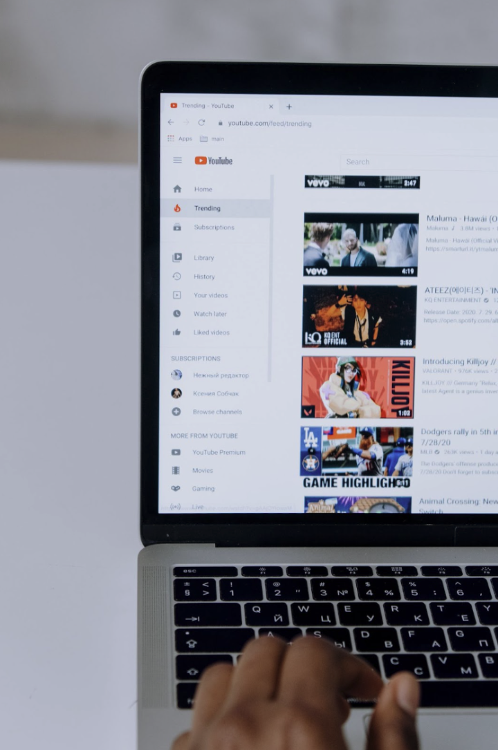
If you're wondering how your current video thumbnails are doing, we definitely recommend checking your YouTube Studio’s Analytics tab. It will show the CTR of each of your videos.
If you're going to spend some time improving your thumbnails now, we recommend keeping track of performance. Over time, you can see the difference between your old and new thumbnails.
You can also experiment with changing the thumbnail of a video that hasn't performed well in the past — to see whether that increases the click-through rate.
What makes a great thumbnail?
A great thumbnail includes the following:
The right size and format are essential for the thumbnail to look good. The best way to ensure you've got the correct dimensions is always to check YouTube's official guidelines; that way, you're safe. As of today (16.08.23), those are 1280x720 (with a minimum width of 640 pixels).
Make sure the thumbnail clearly communicates what the video is about in seconds. That usually means adding the title of the video, or a shortened version of it, as text onto the thumbnail.
It grabs people's attention with colors, icons, emojis, and/or a person that's engaging to look at.
It evokes one of our human emotions: anger, happiness, surprise, disgust, sadness, and fear — many do this by having the person on the thumbnail pull a face that expresses one of those emotions.
A great thumbnail is engaging yet simple — it doesn't have any unnecessary distractions and keeps a consistent look and feel. You can avoid any distractions caused by your backdrop by using remove.bg to remove the background and replace it with another. More on that below.
It's consistent with your other thumbnails and recognizable.Many successful YouTubers use a specific set of colors, fonts, and visual compositions in their thumbnails so their viewers always recognize their videos at first glance. It creates a consistent and strong brand and just makes it easier for users to find their favorite YouTubers when scrolling through their feed full of videos.
Examples of great YouTube video thumbnails
Here are some examples of YouTube channels that have gone through the roof and their thumbnails. We also cover how you can go about creating your own below.
Spotting a Diary of a CEO video in your YouTube feed is easy — the thumbnail is just instantly recognizable; it’s simple, clearly tells you in the text what the video is going to be about, and the headshots of interview partners always show the emotion of the video.
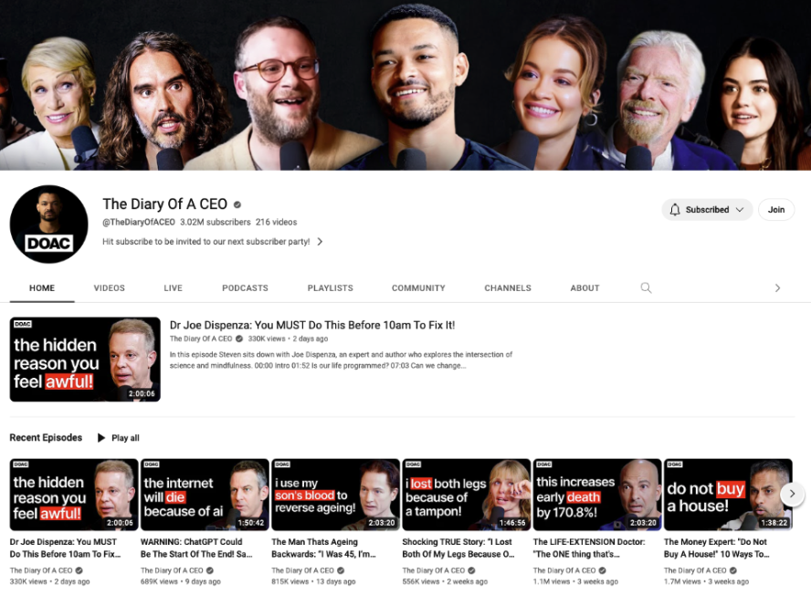
You can also see here that if you go into someone’s channel, the thumbnails are actually quite tiny — so keep that in mind when you’re creating them. The text and icons on your thumbnail should never be too small.
MadFIt is an incredible YouTube fitness channel full of workouts — her YouTube thumbnails are super clean, with a pretty plain background, a clear text of what kind of workout the viewer can expect, and an image of the instructor to engage the audience.

The most important thing in all things thumbnails: consistency
The thing most people miss when they’re creating their YouTube thumbnails is consistency. It will also make your channel look professional. So pick and choose:
One or two consistent fonts.
A palette of colors (around 4 colors is enough). If you haven’t defined your brand colors yet — you can play around with Canva’s color palettes to find what you’re looking for.
A plain background with little distractions — it can be colorful but not busy.
What person is going to be in the thumbnail to evoke emotion and connection? If the contents of the video have a central person talking, it should definitely be that person.
How to create a winning thumbnail background for YouTube videos in no time with remove.bg & Canva
First things first — you're going to want to create the main image, aka the cutout of the main person or protagonist talking in the video. You have two options to do this:
Either you take a photo of the person looking into the camera, pulling a happy, sad, angry, or confused face — wearing the same clothes as in the video.
Alternatively, you take a screenshot of the video where the person is pulling the face with the emotion you want to portray. This is the one we opted for, and it definitely takes less time.
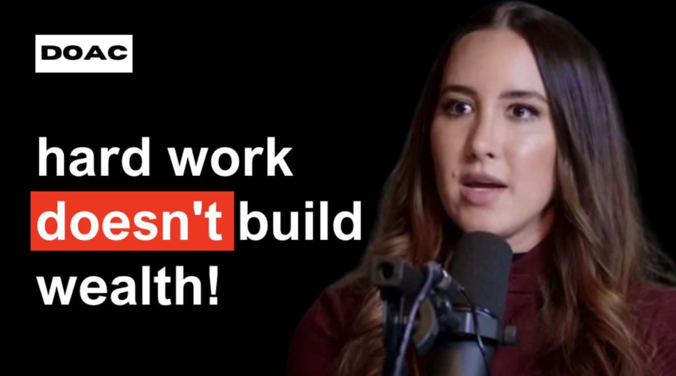
We’re gonna go ahead and recreate this thumbnail from the video. It’s just an example of how to go about it; you can, of course, work with different colors, fonts, etc., but the steps will be the same.

Let’s dive in:
Stop the video where your main protagonist (that might be you) has a good engaging expression. We went ahead and did it on this video at 57:53. Then, take a screenshot.
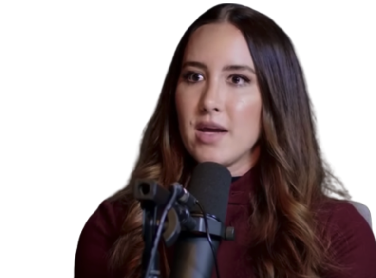
Now hop on over to remove.bg to remove the background. Drag and drop your screenshot onto the site, and within seconds, it will remove the background like this:
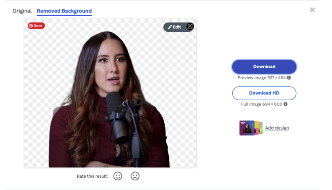
In case it removes anything you don’t want to be removed, or you need to remove something on the edges, you can use remove.bg’s Magic Brush feature. It gives you more control over what remove.bg removes or doesn’t remove so you can get the best results.
If you look closely at her shoulder you can see that there is still a blob of grey left. We’re going to remove that simply by going to > Edit > Erase / Restore > Erase > Brush Size.
You can move the dial to adjust the brush size, click and draw on the transparent background to see the size of the brush. The brush stroke doesn’t need to be exact, it just shows the AI behind remove.bg where the excess background is.
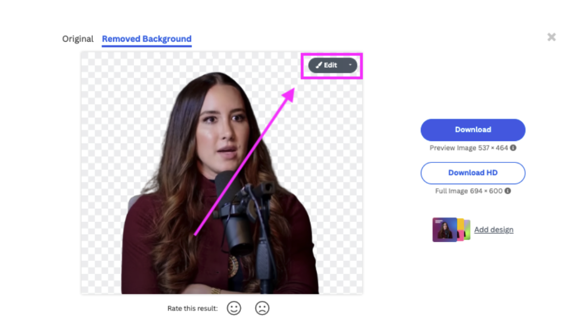
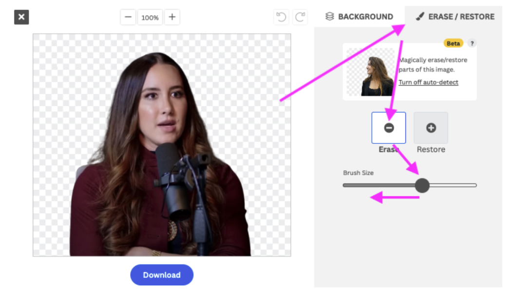
3. Once you’re happy go ahead and draw over the piece of background you want to remove with the magic brush. Within a couple of seconds remove.bg will remove it.
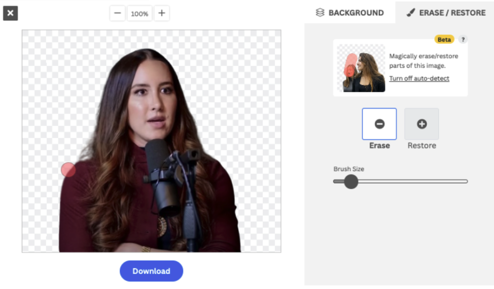
4. Now go ahead and hit > Download.
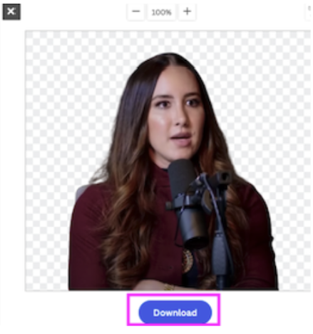
5. Next, hop on over to Canva— your best bet to create a YouTube thumbnail in the quickest and most simple way.
6. A YouTube thumbnail is 1280 pixels wide by 720 pixels tall with a minimum width of 640 pixels with a 16:9 ratio. Luckily you can already find a preset template for this by simply adding ‘YouTube thumbnail’ to the search bar and selecting the blank template.
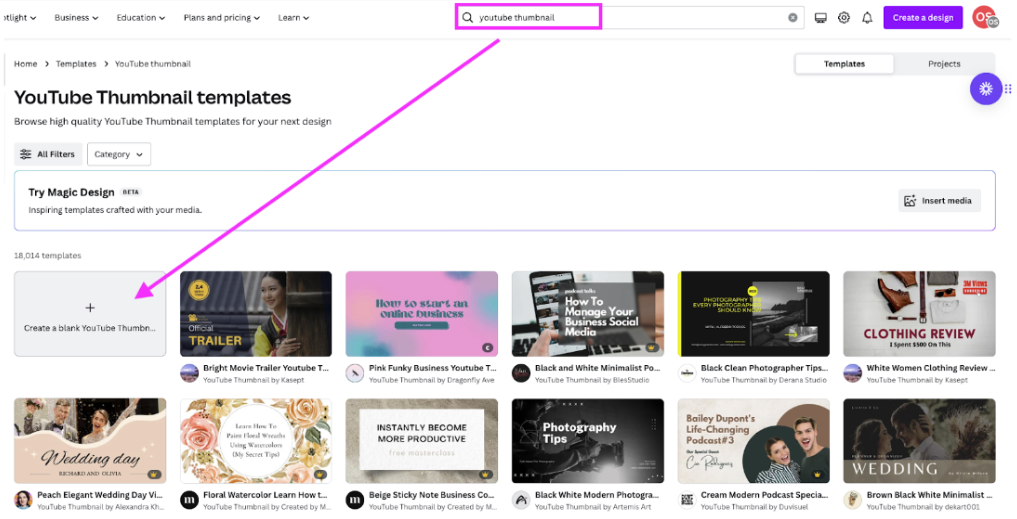
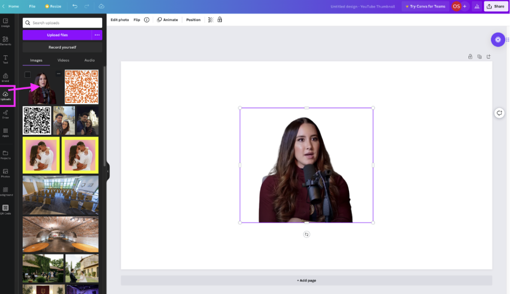
7. First, select > Uploads in the left bar and drag and drop your cutout headshot here. Once it has finished uploading, click on it, and it will appear on your canvas.
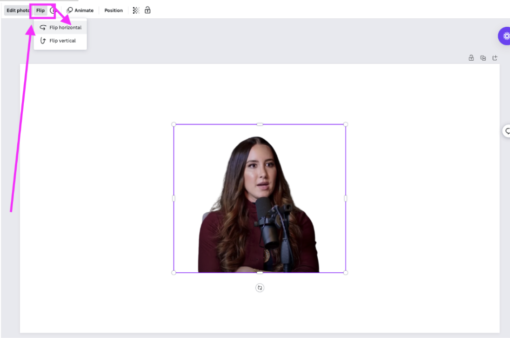
8. If we compare it to the original headshot, the woman is facing the other way — so we’re going to mirror the image by going to> Flip > Flip horizontally.
9. Then go ahead and move the shot around by clicking, holding, and dragging. You can also make it bigger by dragging its corners. You want the headshot to take up about half the thumbnail.
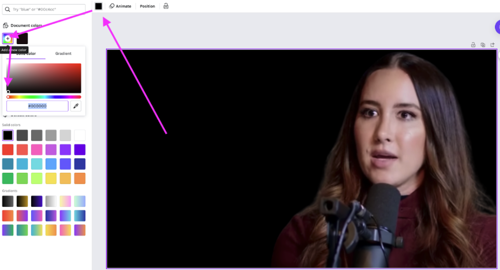
10. Then, you’re going to want to change the background color to black. Click on the background to select it. Then go to > Background color just above the canvas and select the color you would like. We opted for black. But you can opt for white if you want to keep your YouTube thumbnail background white.
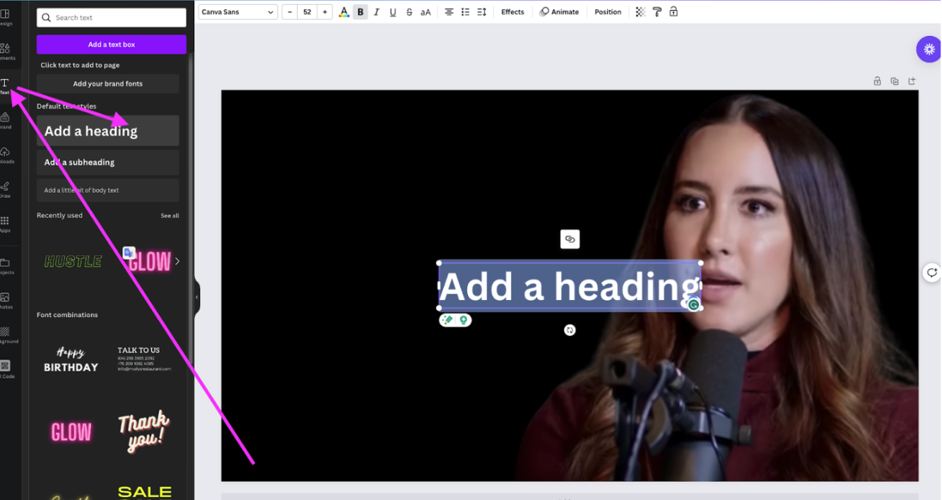
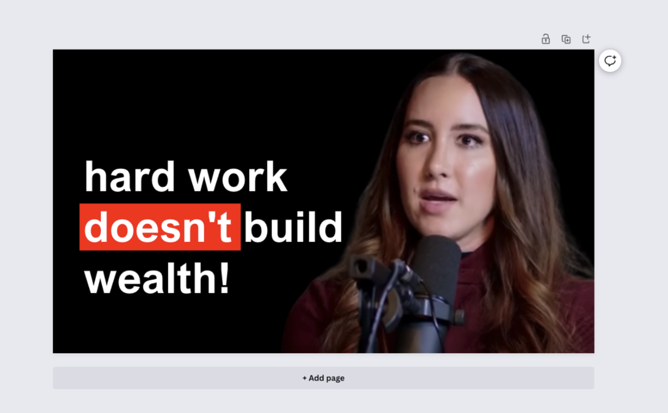
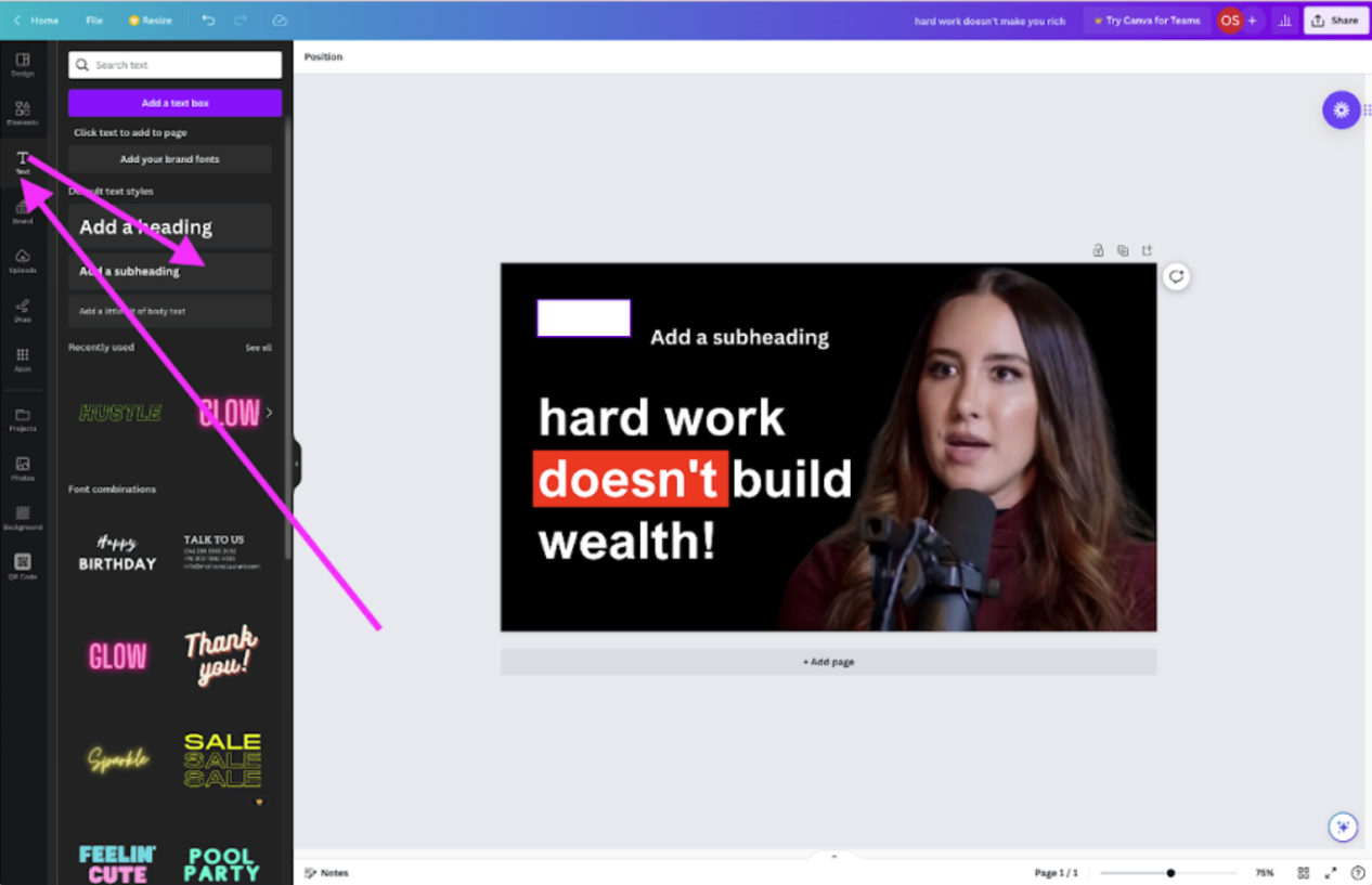
11. Now, it’s time to add text. Go ahead and select > Text > Add a heading. We added the title ‘hard work doesn’t build wealth!’ just like in the thumbnail above.
12. You can move the placement of the text by clicking on it and dragging and dropping it. You can also change the font by selecting the ‘A’ symbol just above the canvas and choosing a font that takes your liking. We went for Arial Nova, seeing as it’s similar to the original.
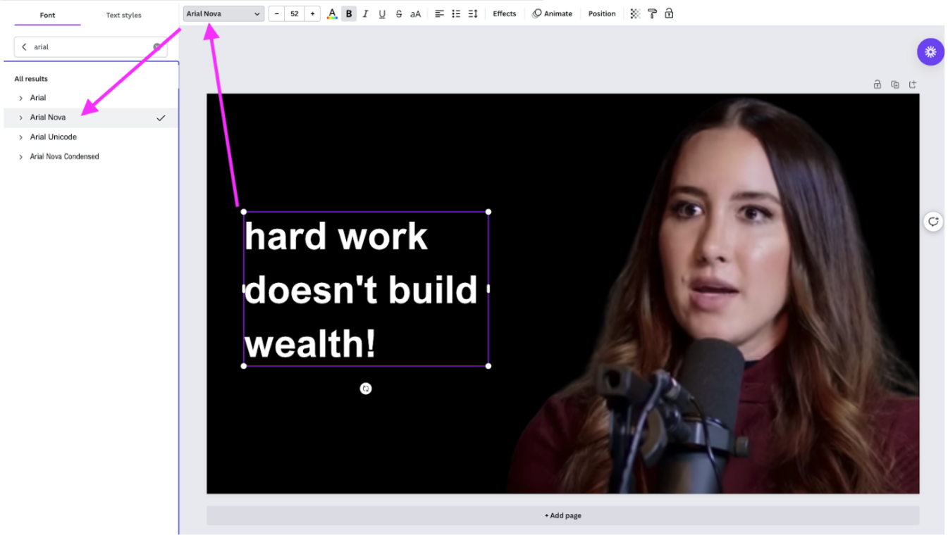
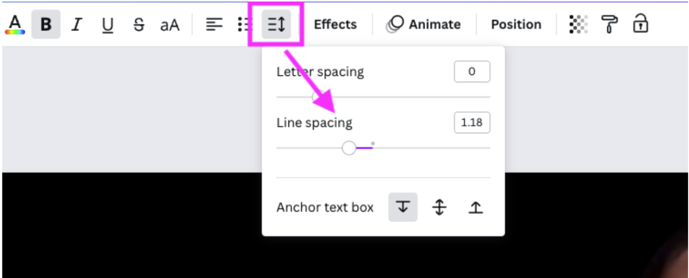
13. We also had to adjust the line spacing (so how much space is between each line, as they were too far away from each other).
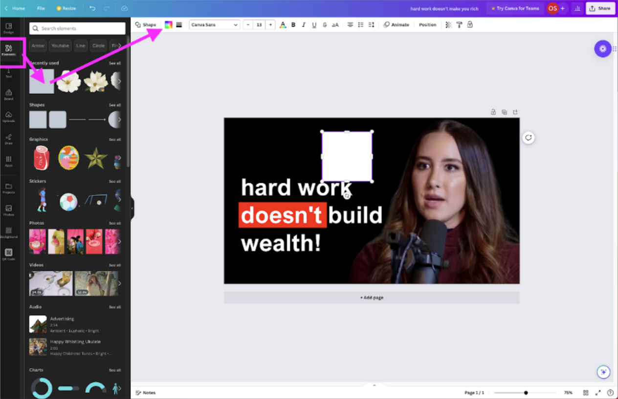
14. Next up, we’re going to add the red-colored block behind the word ‘doesn’t’ — which gives the sentence a bit of structure and depth and adds a pop of color to the thumbnail. Go to > Elements > select the Square. Then go to > Color and select a fiery red.
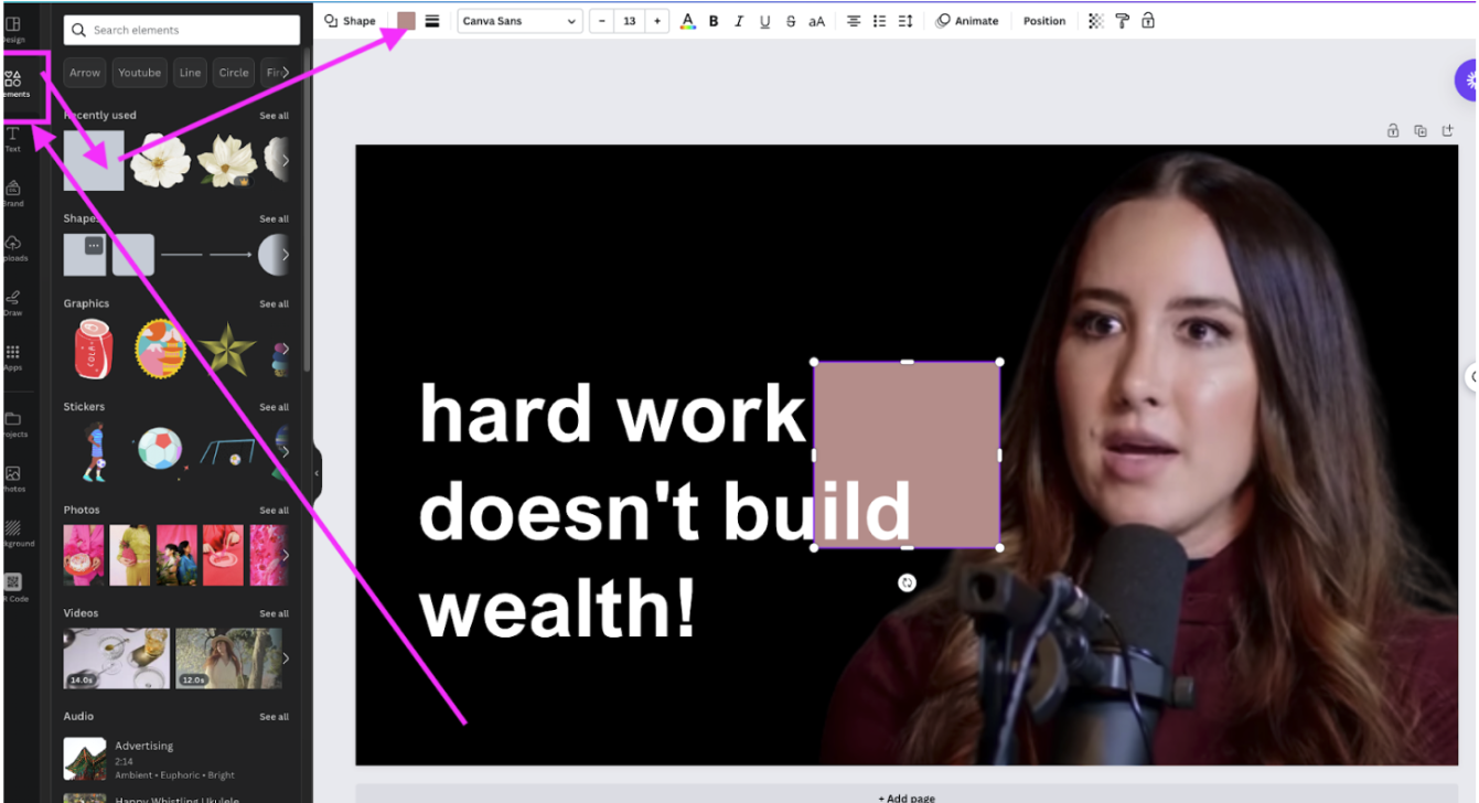
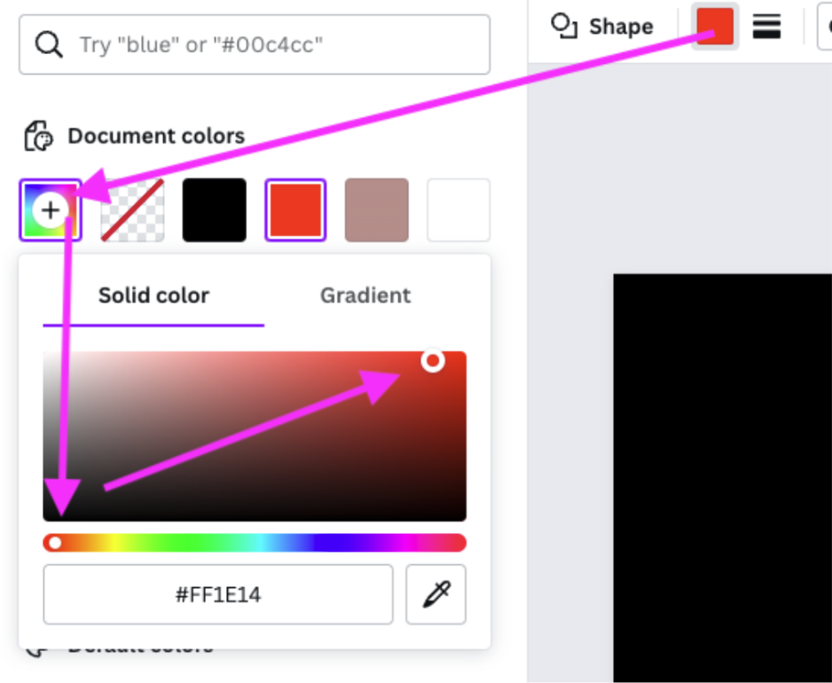
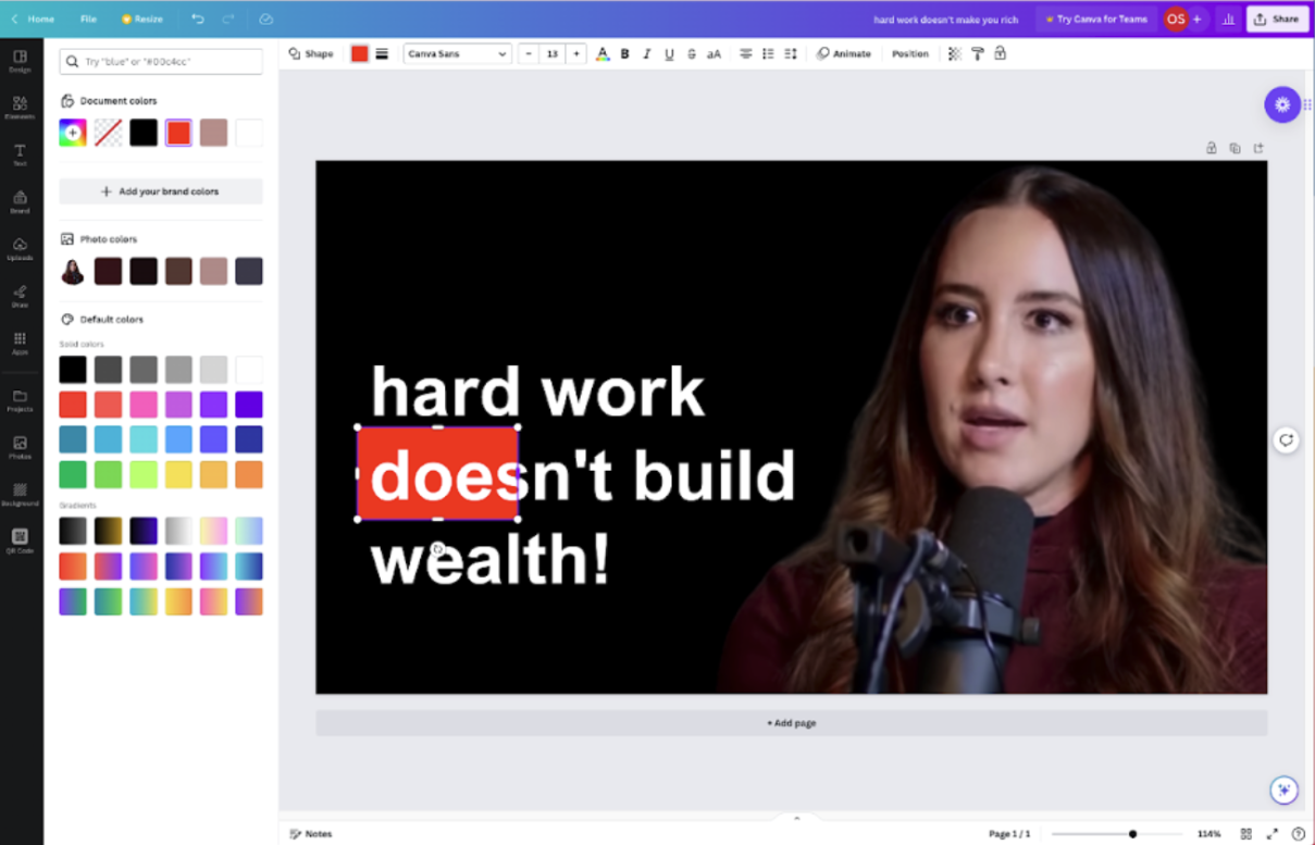
15. Now, you can move it behind the word you want to highlight and adjust the size by clicking and dragging the edges of the square.
16. Next up, you’re going to want to add the last element, the logo or name of your show. You can simply upload or recreate it as we did by selecting a square again and adding the words DOAC.
This is what we ended up with — pretty neat, right?
Continuously improve and analyze your YouTube thumbnails to ensure success
YouTube success is about gradually increasing views over time for all your videos — and YouTube thumbnails which can improve views, likes, and shares.
Keep an eye on your YouTube Studio’s analytics to see what’s performing well (and what’s not). Ask yourself: do the videos with high conversions have larger text? Is there anything poorly performing videos have in common? Try to bring those visually in line with your more successful ones. You’ll have to wait about a month to see if your changes have an impact.

If you have less time and more budget, you can invest in TubeBuddy’s Legend plan, allowing you to A/B split test two different thumbnails to find out which people like the most.
Finally, if you have a video that isn’t performing as well as it used to or you want to give it a second chance, you can change the thumbnail according to the tips above to give it a boost.
Want to give it a try? Take a screenshot from your video, hop on over to remove.bg and start creating your next best thumbnail today.
Bình luận